

STUDIO MØBLER WEB DESIGN + BRANDING
Through precedent study and design strategy, I redesigned Studio Møbler’s website to reflect their brand: Sustainable and handcrafted furniture.
HOW CAN I REDESIGN A WEBSITE TO EXPRESS AN IDENTITY?
I was tasked to redesign the homepage for a sustainable and custom furniture design company. Their original website has beautiful work. I wanted to highlight their craftsmanship through developing an authentic brand and developing an intuitive website layout.
In order to accomplish this goal, I conducted a precedent study, tested user flows, and developed a cohesive brand narrative and visual language.
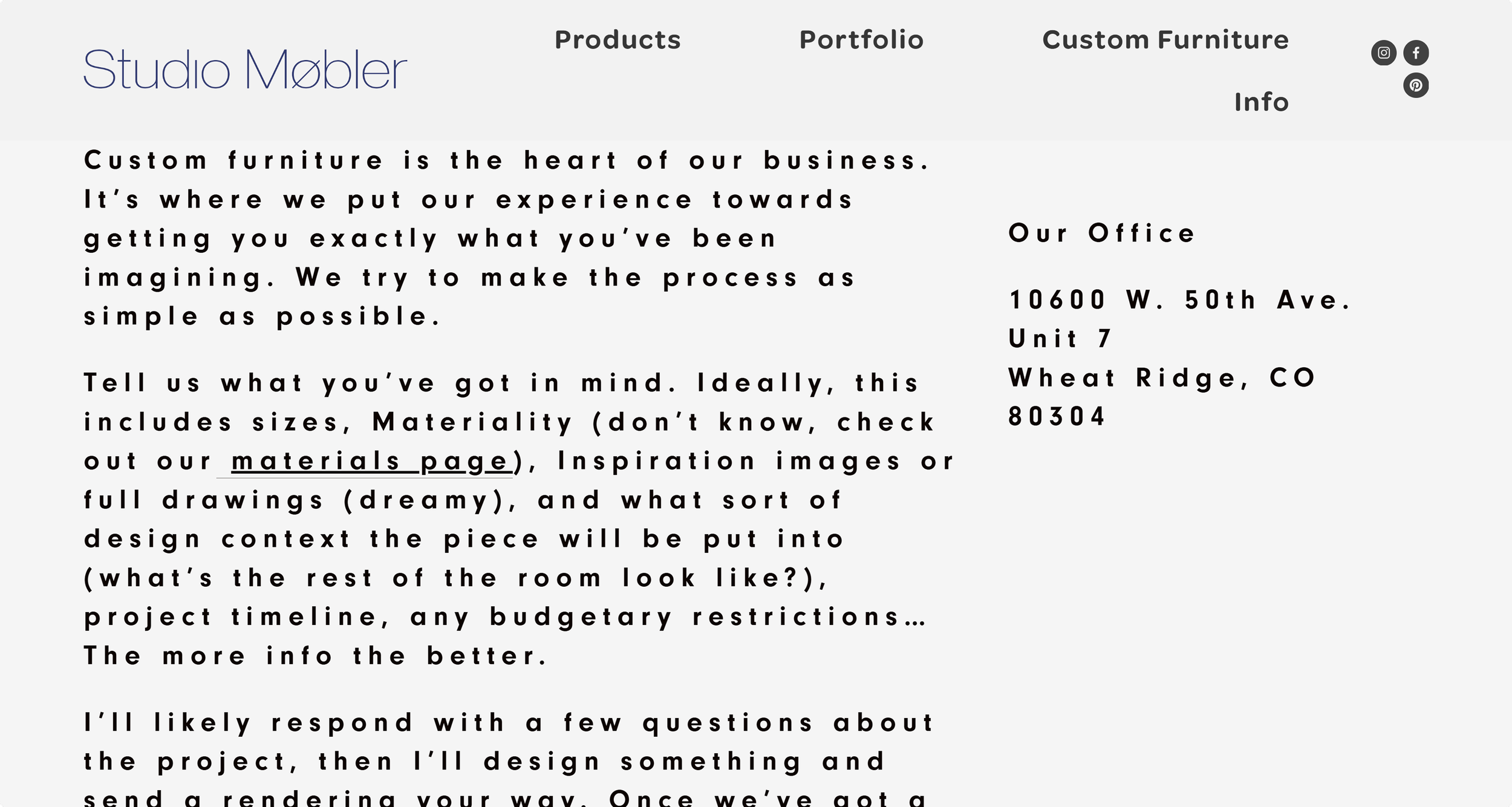
DESIGN GOALS - ORIGINAL WEBSITE
DEFINING VALUES
Their designs show off handcrafted details. They would be further enhanced by a section to introduce brand values.


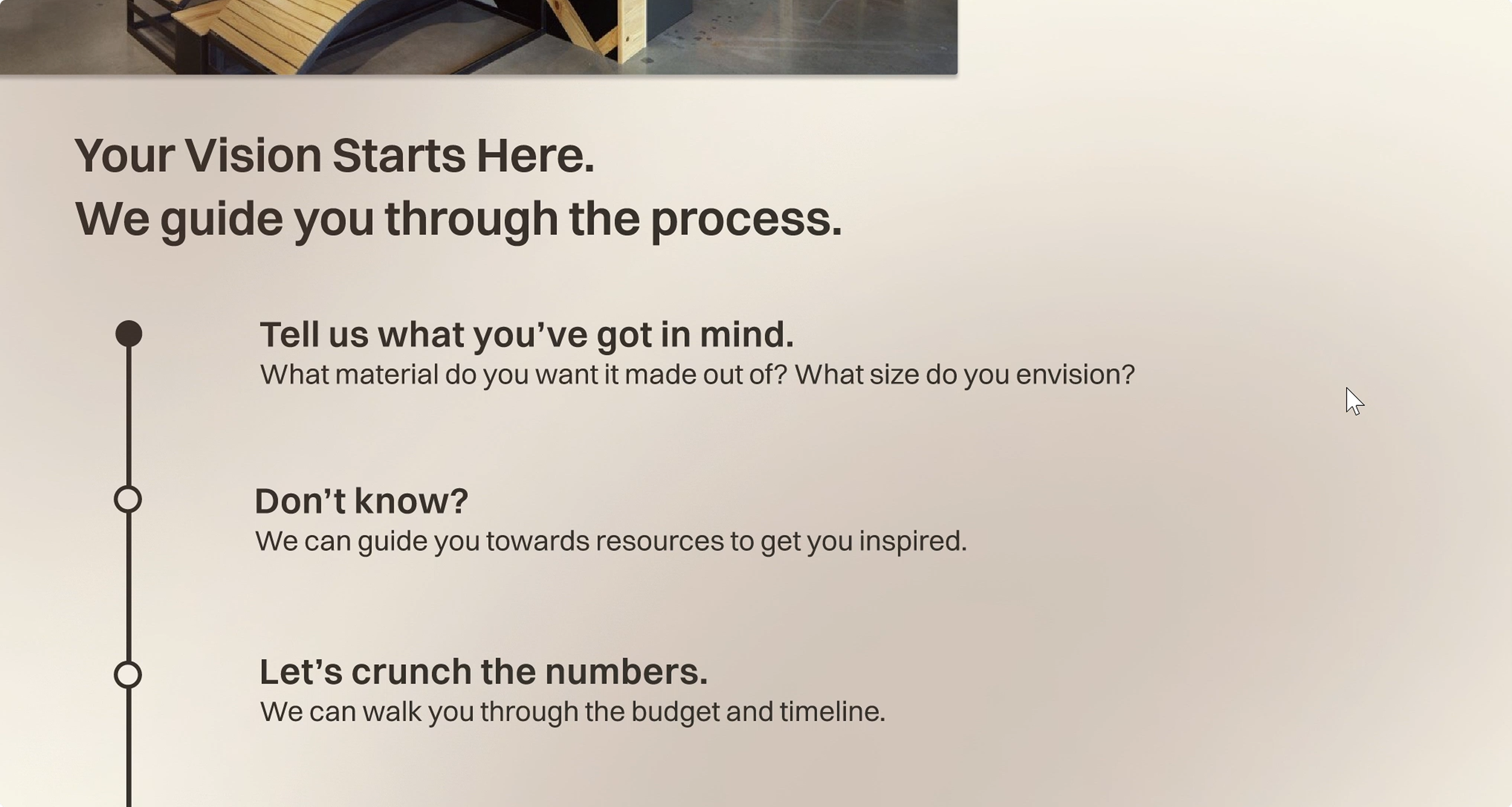
The explanation of the design process is vital information, but it’s hidden. I wanted to communicate this in an engaging way and distill it down.
MAKING PROCESS ACCESSIBLE
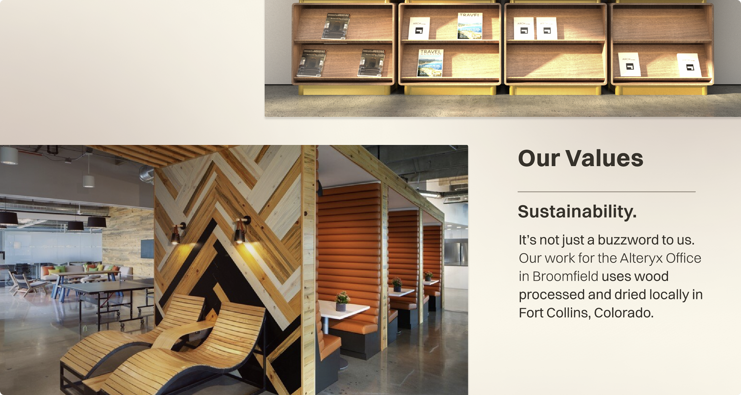
HIGHLIGHTING SUSTAINABILITY
This project is done with all locally sourced wood. It is proof of sustainable practices, and is what sets the firm apart. This project deserves to be on the front page.
PRECEDENT STUDY - ASTEP
EMBODYING THE VALUES
CLEAN NAVIGATION
The layout of Astep’s product page lets the work speak for itself, and does a great job of showcasing the products.
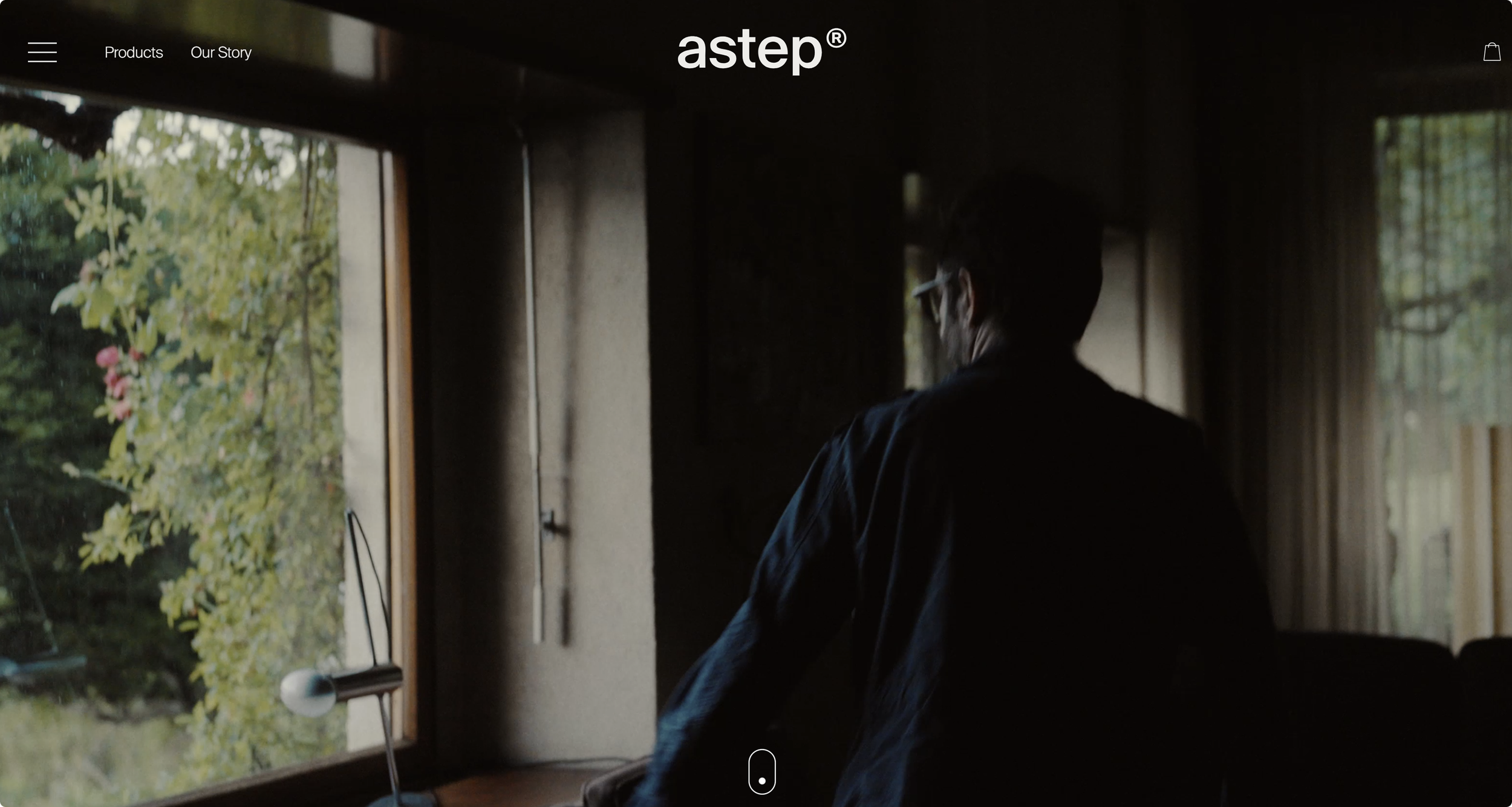
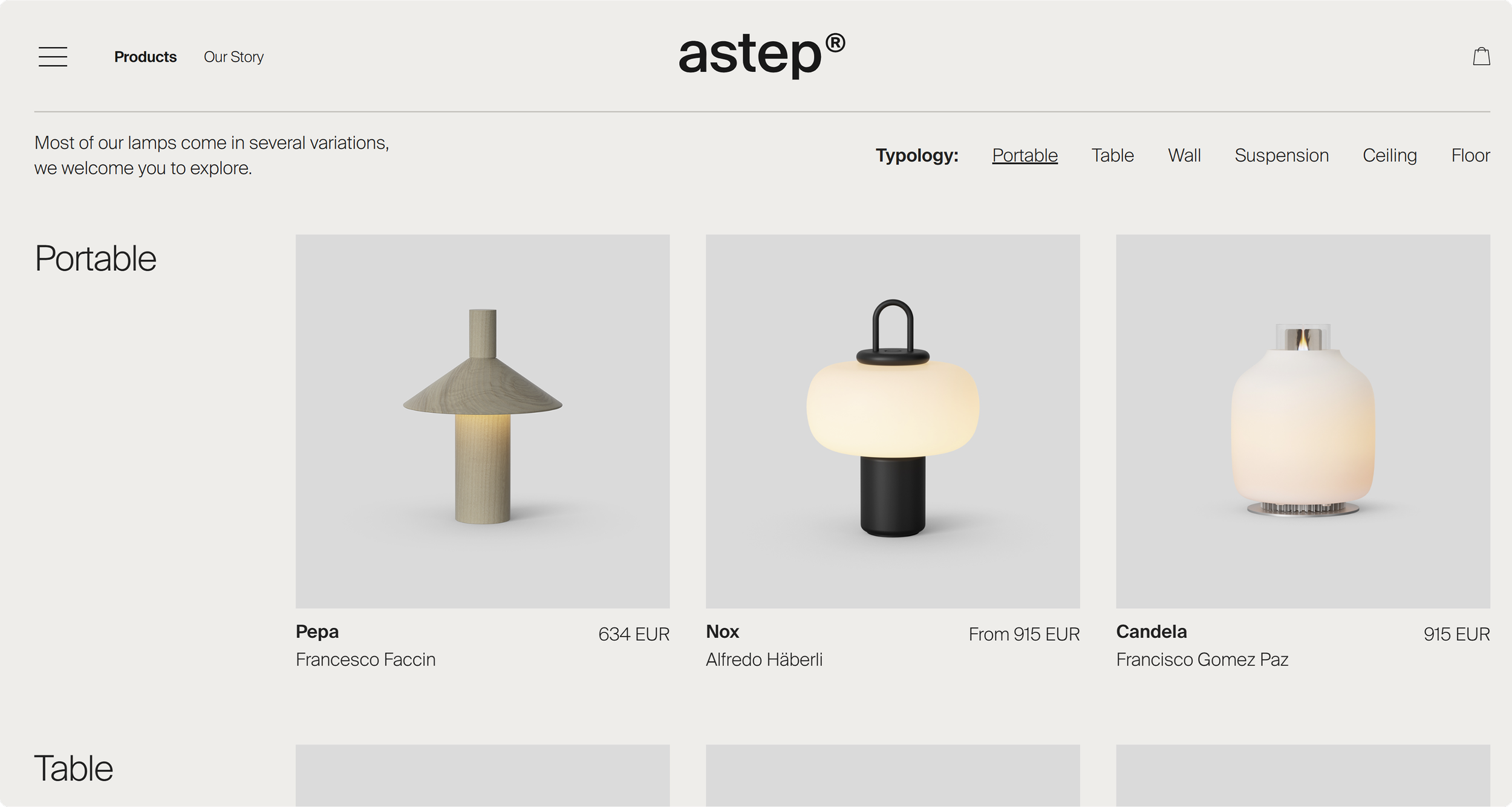
Astep is a Danish lamp company, which has a similar attention to craft with their design philosophy.
Their homepage has a simple and clean layout that would suit the Studio Møbler identity.
BRANDING
LOGO + COLOR PALETTE


Represents a subtle M shape and mimics the forms in the Møbler design language.
The primary color is a cool-toned Khaki that emphasizes the brand’s sustainability. Sienna brown highlights the deep wooden tones of the furniture.
TYPOGRAPHY
Switzer was chosen as the primary font. Clean, undecorated, and simple. This font embodies the values of Studio Møbler.


MY REDESIGN
CRAFTED TO ENDURE.
Inspired by Astep’s homepage layout, I wanted to highlight the furniture while adding clear brand language. I included some information above the fold as well, so users are enticed to scroll down.

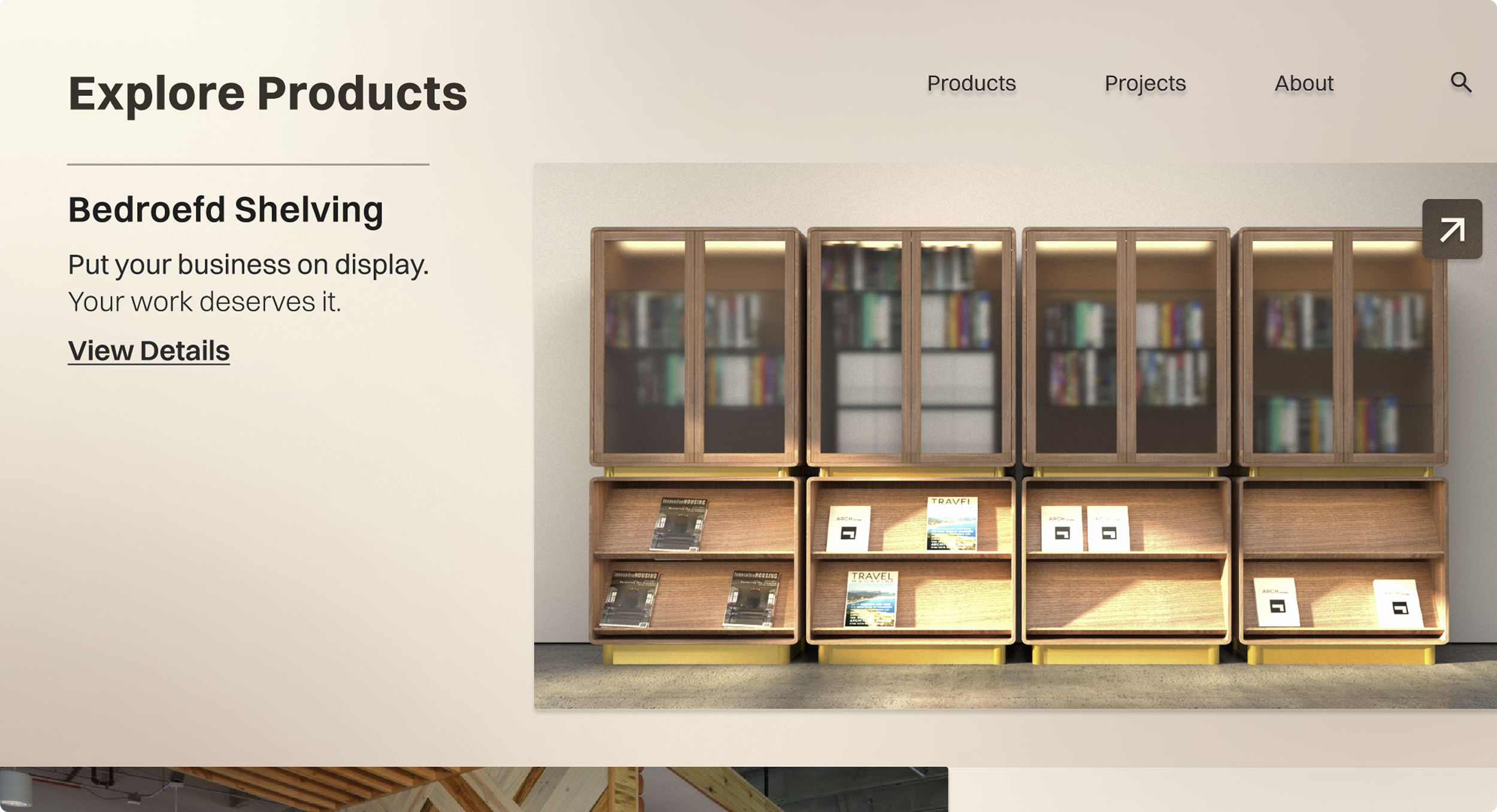
IMPROVED PRODUCT PAGE
Highlighting the products down below gives users a space to scroll and browse through various projects. The navigation menu allows for quick access.
HIGHLIGHTING VALUES
There are rich and detailed projects that are hidden in other tabs of the website, so I brought them to the forefront.
DISTILLING THE PROCESS
Custom furniture means that clients want to be highly involved in the design process. This feature of the homepage takes the user on that journey.