
MOTHER BIRD HARD KOMBUCHA.
A different type of drink for a different type of drinking culture.
PACKAGING DESIGN
BRAND IDENTITY
Among younger, design-conscious drinkers, the growing interest in natural wine, craft beverages, and contemporary food culture is creating a different approach to drinking. This emerging culture is centered on taste, experience, and discovery, rather than party excess.
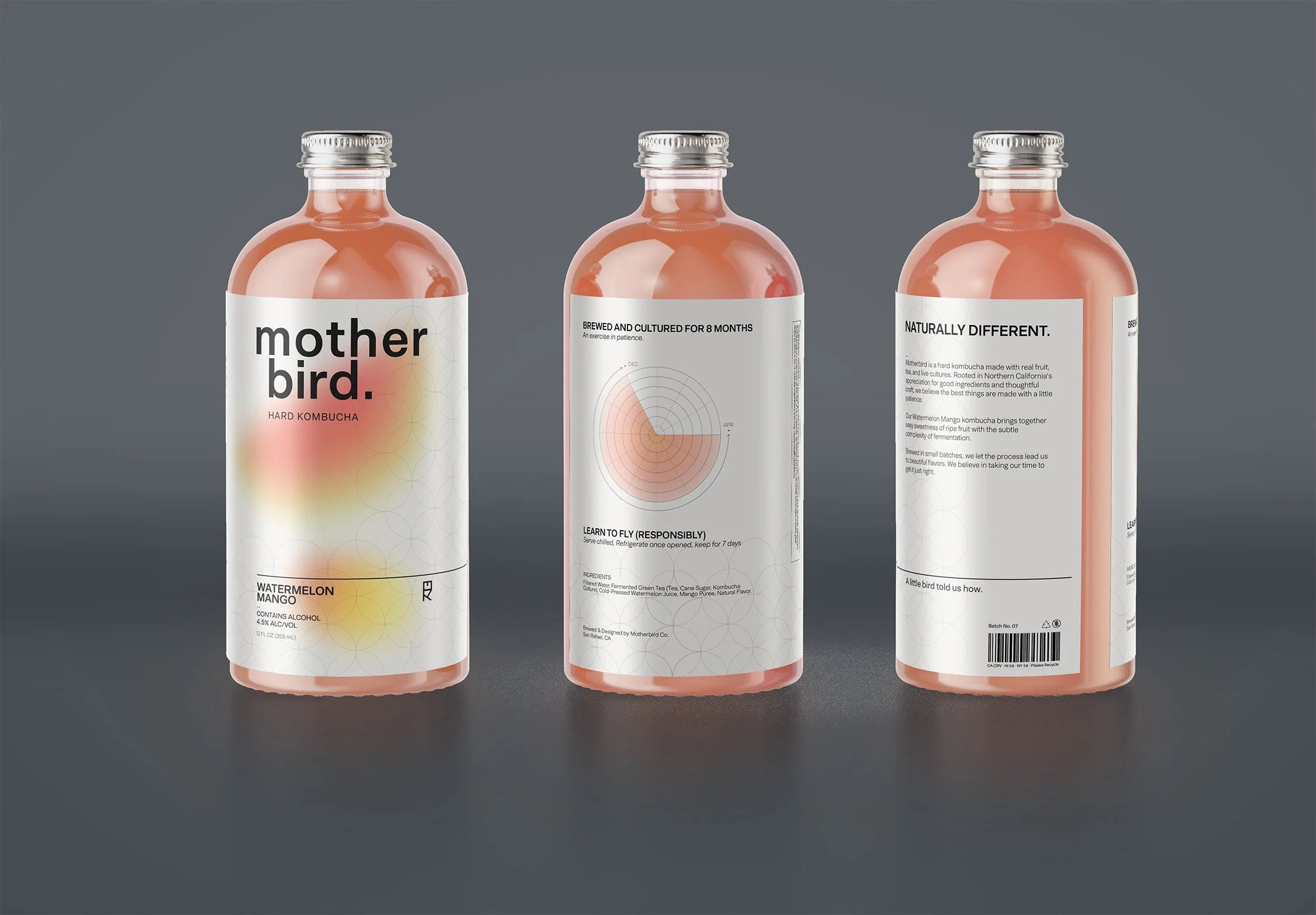
I wanted to explore how this more intentional relationship to drinking could position Motherbird as an alternative to conventional party drinks. I wanted something that feels just as at home at a natural wine bar or dinner with friends as it does at a casual gathering.
THE CHALLENGE
EXPRESSION WITHIN RESTRAINT
I approached the identity through a balance of expression and restraint.
The name Motherbird is inspired by the literal Kombucha “mother” which is an essential ingredient in the drink.
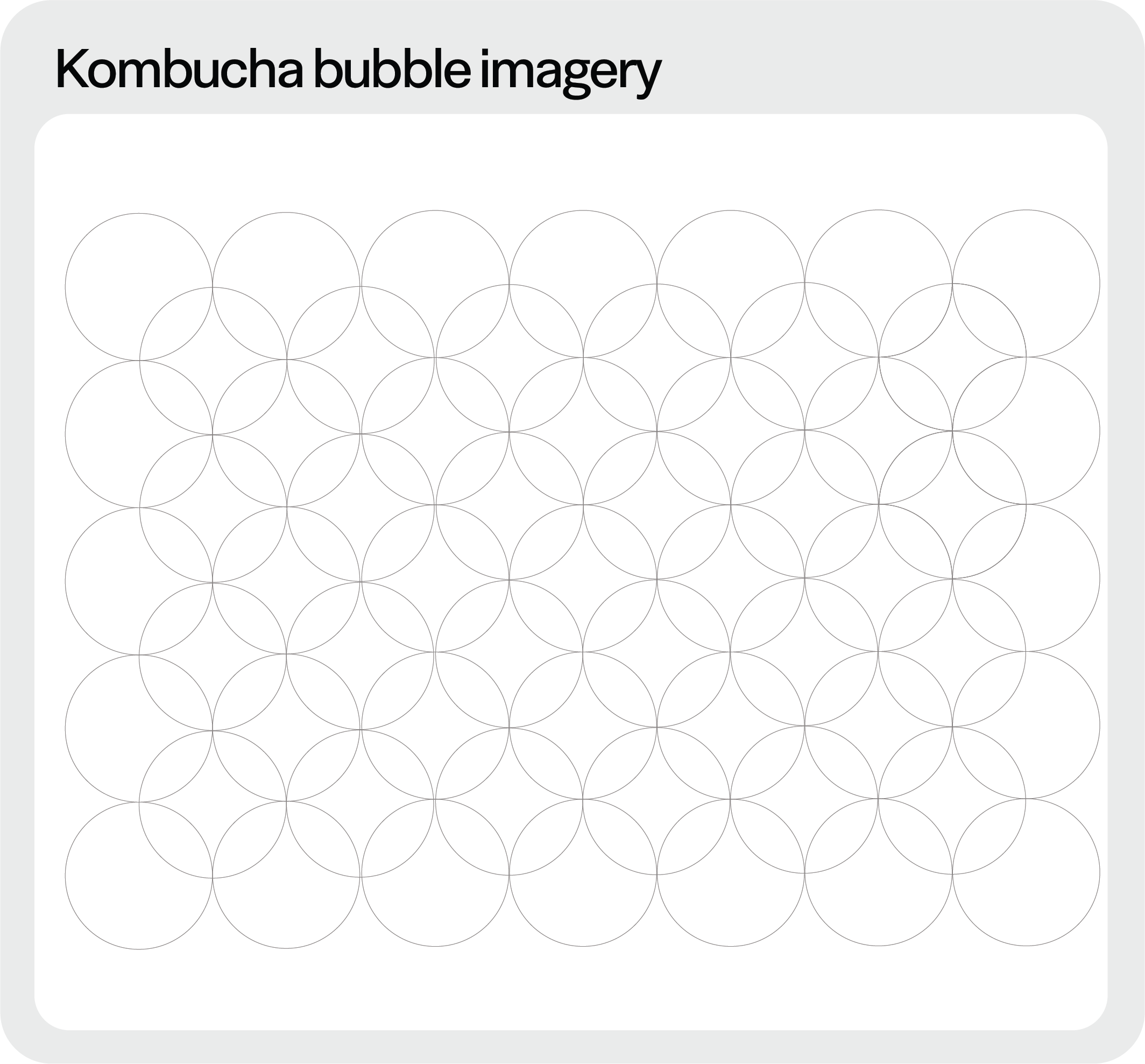
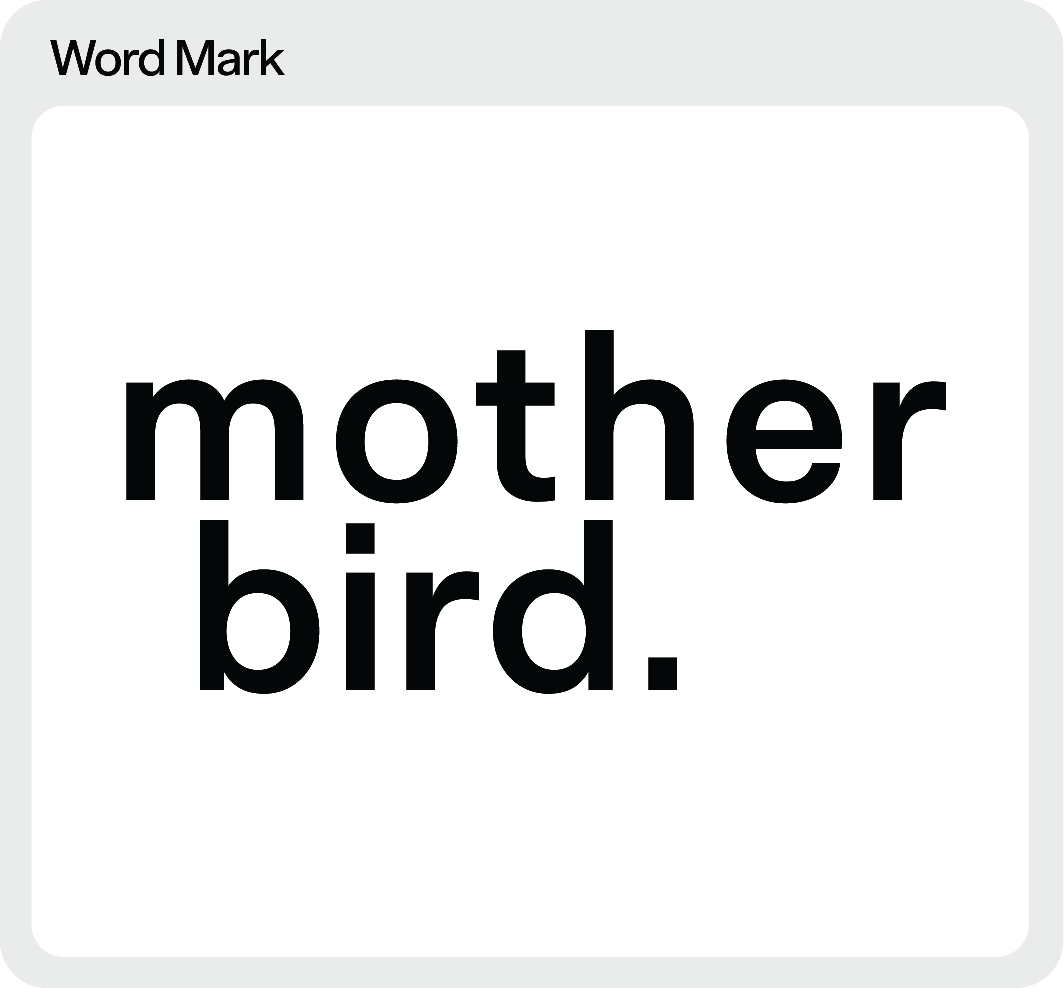
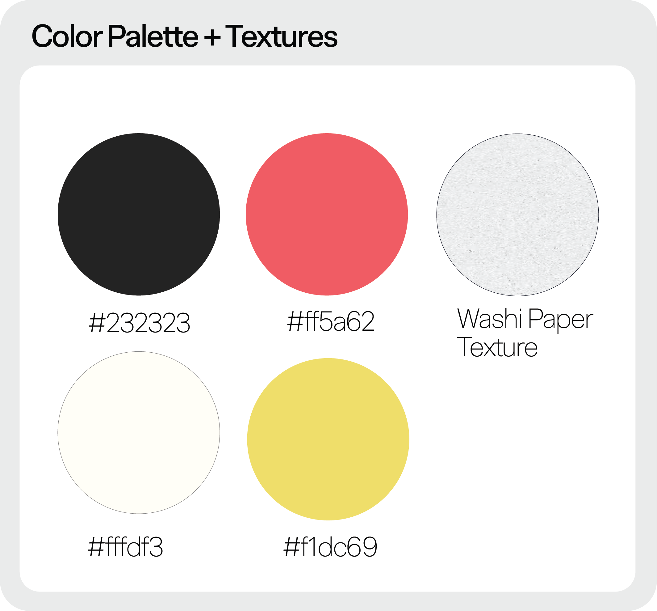
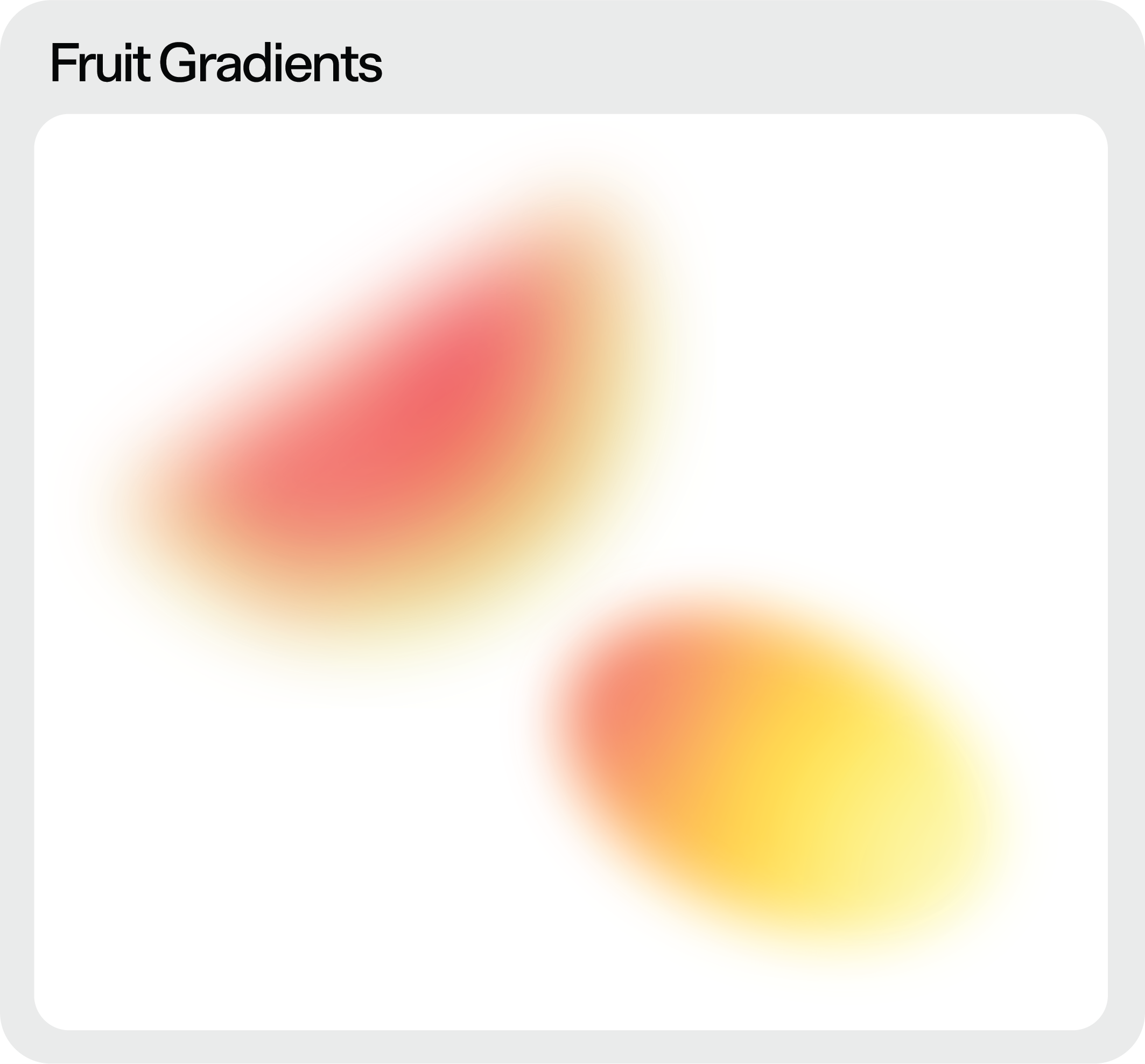
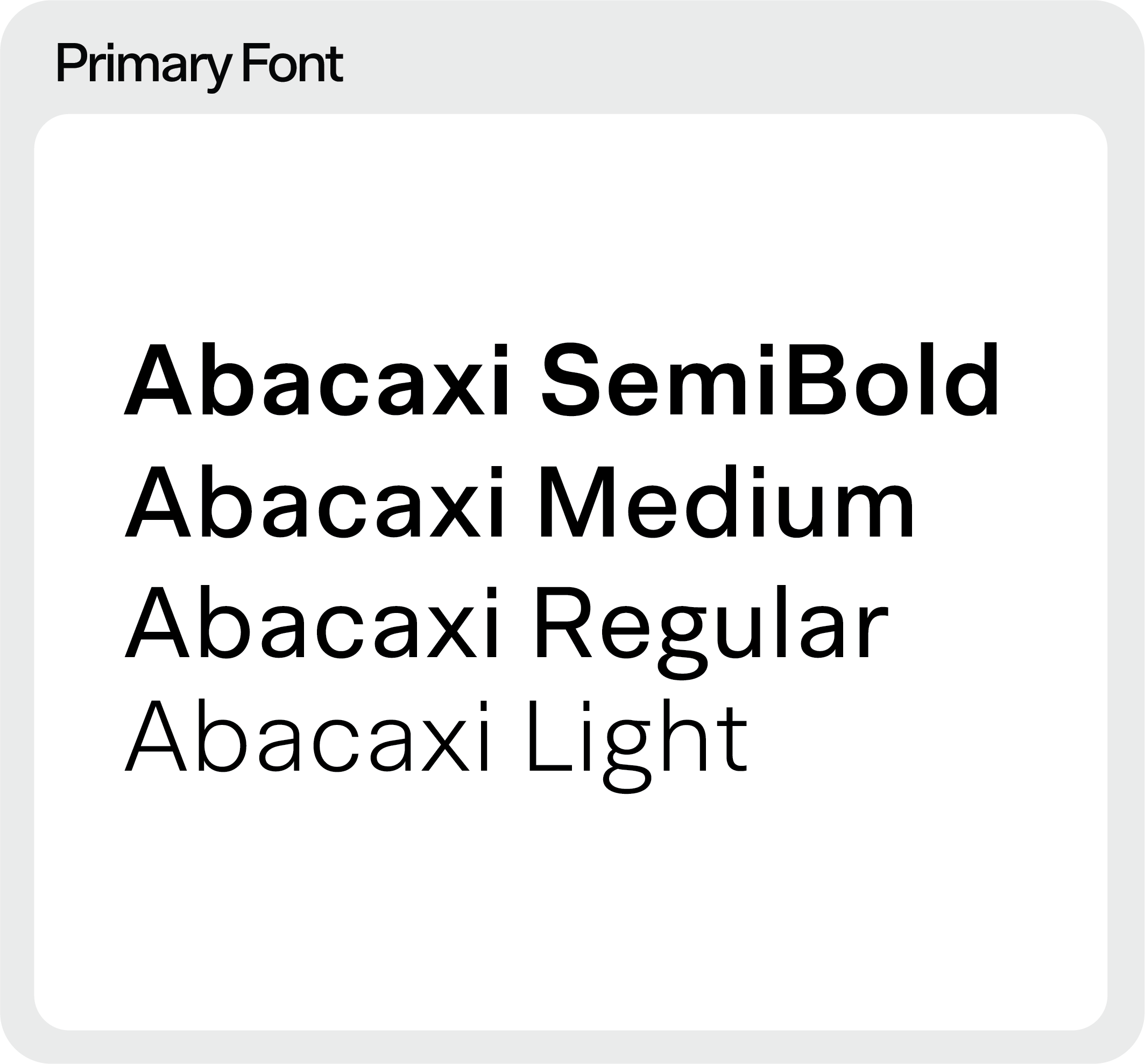
The playful, fruit-inspired graphics bring a sense of warmth and spontaneity to the packaging, while structured typography provides an architectural foundation.
EXPRESSIVE GRAPHICS
RESTRAINED TYPOGRAPHY
How do you create a hard kombucha brand for a generation whose tastes are evolving beyond conventional drinking culture?
FULL DIELINE
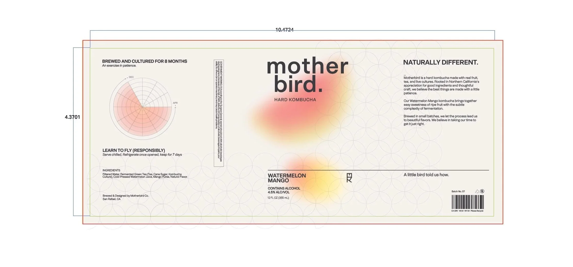
RESULT
The final identity positions Motherbird as an alternative to conventional party-oriented alcohol brands, using expressive graphics and structured typography to communicate a more intentional and tasteful approach to drinking for a younger audience.